
Be sure to click the four large letters (C, R, A, and P) below for more information.
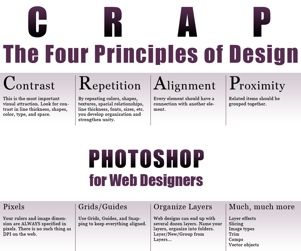
Purpose: Create interest on the page and aid navigation.
How to Get It: Vary typeface and weight. Design in white space. Vary color Hue, Saturation, or Lightness.
Avoid: Being wimpy. Go big or go home.
Example: The CRAP letters are huge in comparision to the body text. Lots of white space on either side of the Photoshop title. The display text is much darker than the background.
Purpose: Unify and add visual interest.
How to Get It: Push existing consistencies a little further. Pull out a section out of a common graphic and use it repeatedly. Use the same horizontal rule in various places.
Avoid: Overdoing a repetition so that it becomes annoying.
Example: There are only two typefaces used in this example. The display text uses the same gradient. The eight text areas are nearly the same. Only two colors are used.
Purpose: Unify and organize.
How to Get It: Create a grid and use. Align elements to each other. Look at every single element and decide if that is really the best location for it.
Avoid: More than one type of text alignment. Don't use centered text by default.
Example: The large CRAP letters are centered aligned over their description. The whole page is layed out on an evenly spaced grid. Photoshop for Web Designers was tracked so that it aligned to itself.
Purpose: To organize and convey information better.
How to Get It: Blur the page (squint at it) and count the number of stops your eye makes. There probably ought not be more than five groups. Put headers right next to body text. Space unrelated items away from each other.
Avoid: Too many separate elements. Putting elements in the corners and middle. Equal white space between elements unless part of a sub-set.
Example: The body text is just below its header. Generous white space above the word Photoshop.