
A responsive image is one that will get no larger than its original size, but can shrink to a percent of its container. Make your browser window wider and narrower to see what happens.
Related to this is ensuring small images are delivered to tiny screens and large images are delivered to desktop monitors. Read the Responsive Images in Practice article for how to do that.
The CSS is:
img {
	max-width:100%; /* offically only applies to block elements... */
	display:block;  /* so we make it a block */
}
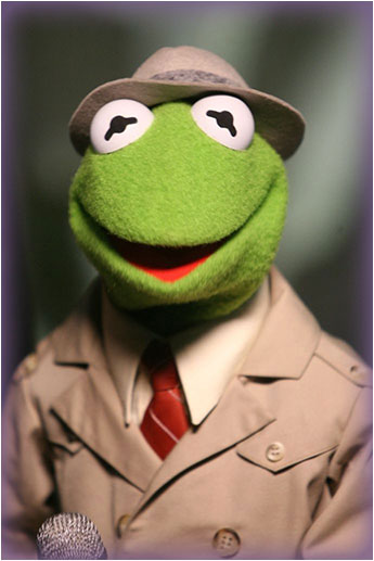
and the HTML is:
<div style="width:30%">
<img src="kermit.jpg">
</div>
You’ll notice that we need a container for the image. For large images that take up nearly the whole width of the viewport, then <body> could be your container, but for smaller images, like in this example, you will need an artificial container that specifies the dimension.
Do not include a width and height attributes on the image tag. e.g. <img src="kermit.jpg" width="345" height="517">
In the above example, you’ll notice that Kermit starts sliding to the left when the browser window is wide. This is because the image doesn’t go any wider than 345 pixels, but the <div> can go wider, and the image is left-aligned.
Setting text-align:right on the <div> won’t work because the <img> is defined as a block (and therefore takes up 100% of the width). A quick fix is to remove the display:block; which effectively turns the image back into an inline element. Your code is then:
<div style="width:30%; text-align:right;">
	<img style="max-width:100%; vertical-align:bottom;" src="kermit.jpg">
</div>
This introduces a new problem that may, or may not be an issue depending on your page design. A small 3 pixel (or so) gap will appear underneath the image. That can be removed with vertical-align:bottom on the <img> tag.
IE and Firefox won’t recognize the max-width:100% on the image when the image is placed inside a <td> tag, or an element with display:table-cell.
|
This can be fixed by also setting This responsive image has been fixed using: td img { width:100%; /* Needed for IE and Firefox when inside a <td> */ } |
Notice that text can go over the top of this one.
<div class="width30percent" style="max-width:345px; float:right; clear:right; margin-left:2em; color:white;">
<div id="kermit">
<p>Notice that text can go over the top of this one.</p>
</div>
</div>
#kermit {
background: url(../cssInfo/kermit.jpg) no-repeat center center;
background-size: cover;
height: 0;
padding-bottom: 150%; /* 16:9 is 56.25% */
}
.width30percent {
width:30%;
}
I often want to either frame an image with a border (or some other styling), and then usually either float it left or right. The following CSS is typical of my coding style.
.pushLeft {
	float:left;
	margin-right:2em;
	margin-bottom:1em;
}
.pushRight {
	float:right;
	margin-left:2em;
	margin-bottom:1em;
}
img.framed {
	border:10px solid #999;
}
.responsive480 { /* place on a div containing a 480px wide (or narrower) photo  */
	width:45.5%; /* this number will depend on how wide your page is */
}
.responsive480 img {
	max-width:100%;
	box-sizing:border-box; /* needed when framing the image */
}
.responsive480.pushRight {
	text-align:right;
}
You will notice that I chose to put a border around the image (<img class="framed">). As described above, there should be no image dimension attributes on the <img> tag.
I also chose to float the image right. This was done by wrapping the image tag with a div and then giving that div a couple of classes. (<div class="pushRight responsive480">).
Lorem ipsum dolor sit amet, consectetur adipiscing elit. Sed euismod mollis molestie. Phasellus congue rutrum nisi, in consequat risus adipiscing id. In hac habitasse platea dictumst. Nulla ac quam ligula. Proin euismod mi ut felis viverra tristique. Ut ut auctor diam. Aliquam commodo varius mi, at accumsan mi varius at
<div class="pushRight responsive480"><img src="../media/FLVPlayerSkins/ClearSkin3.jpg" class="framed"></div>
<h3>The HTML needed for this paragraph and photo is shown below.</h3>
<p>Lorem ipsum dolor sit amet, consectetur adipiscing elit. Sed euismod mollis molestie. Phasellus congue rutrum nisi, in consequat risus adipiscing id. In hac habitasse platea dictumst. Nulla ac quam ligula. Proin euismod mi ut felis viverra tristique. Ut ut auctor diam. Aliquam commodo varius mi, at accumsan mi varius at</p>
The above techniques work well for images, but some elements don't respond quite so well (such as videos and some SVG graphics). The problem is they will not maintain a proper aspect ratio, but you can force it using this technique.
/* MISC */
.aspectRatioWrap {
   /* You will also need to explicity set the padding-top percentage on the element you assign this class to. */
   position: relative;
   height: 0;
   width: 100%;
}
.aspectRatioWrap >:first-child {
   position: absolute;
   top: 0;
   left: 0;
}
On the wrapping <div>, explicity give it a padding-top percentage, which is calculated by dividing the height by the width. For example, the above video is 480px by 270px. So, 270/480 = 0.5625, which means the HTML should be:
<div class="aspectRatioWrap" style="padding-top:56.25%;">
	<video src="../media/BbbTrailer.h.264.mp4" controls style="width:100%;">
	</video>
</div>
The image below is 1024px wide with High jpeg compression. It looks better for standard pixel density screens and is smaller, but it is fuzzier on a Retina display. So, which image to use? It is kinda of a toss-up, but I'm leaning towards the smaller image.

The image below is 2048px wide with Medium jpeg compression. It looks great on a Retina display, but is a tad larger (file size) than the image above.
